Introduction
Spatial Equity NYC (SE), a tool developed by MIT’s Norman B. Leventhal Center for Advanced Urbanism (LCAU) in close collaboration with New York City-based nonprofit Transportation Alternatives (TA), visualizes mobility, environment, and health data. Through thoughtful analysis, visualization, and re-aggregation of publicly available data, SE reveals spatial inequities in how public space is designed, distributed, and accessed. In making data easily accessible and actionable, Spatial Equity NYC is a tool for data-driven civic engagement and urban policy-making that can help community members advocate for change.Motivation
Using open government data (OGD) to inform policy and decision-making can be a promising approach to promote equity across U.S. cities. However, while OGD is “open” in the sense that there is a number of datasets published through government portals, OGD remains “closed” and inaccessible to members of local government that lack the technical expertise or data science background to analyze and make sense of raw data. Moreover, because OGD is often decentralized and scattered across several different portals, users are unable to identify trends and patterns or draw relationships between datasets. These challenges ultimately bar members of local government from effectively using OGD to inform their work.There have been attempts to deal with these issues, namely in the development of equity mapping tools that illustrate spatial disparities in the distribution of resources and outcomes by overlaying socioeconomic data with equity indicators of interest within a centralized dashboard. However, these tools are still limited in that they either focus on national or state-level data or tend to aggregate data to zip code or census tract levels which may not necessarily be the levels at which members of local government make decisions. Additionally, the tools developed by and oriented towards government actors often lack community input and local context. As such, the tools are primarily used for “preliminary screenings.” To a lesser extent they are used to support decision making processes and there are even fewer instances in which the tools are used to guide new policy outcomes.
In our research project, we seek to address this gap in the current landscape of equity mapping tools. In collaboration with a community advocacy group, we developed Spatial Equity NYC to better suit the needs of local political stakeholders by aggregating data to relevant political boundaries in New York City, enabling comparisons between districts across a number of equity indicators.
Features
Several design decisions were made in the development of the web application displaying the data in the form of interactive data visualizations. The resulting features were developed:Comparative representation of information
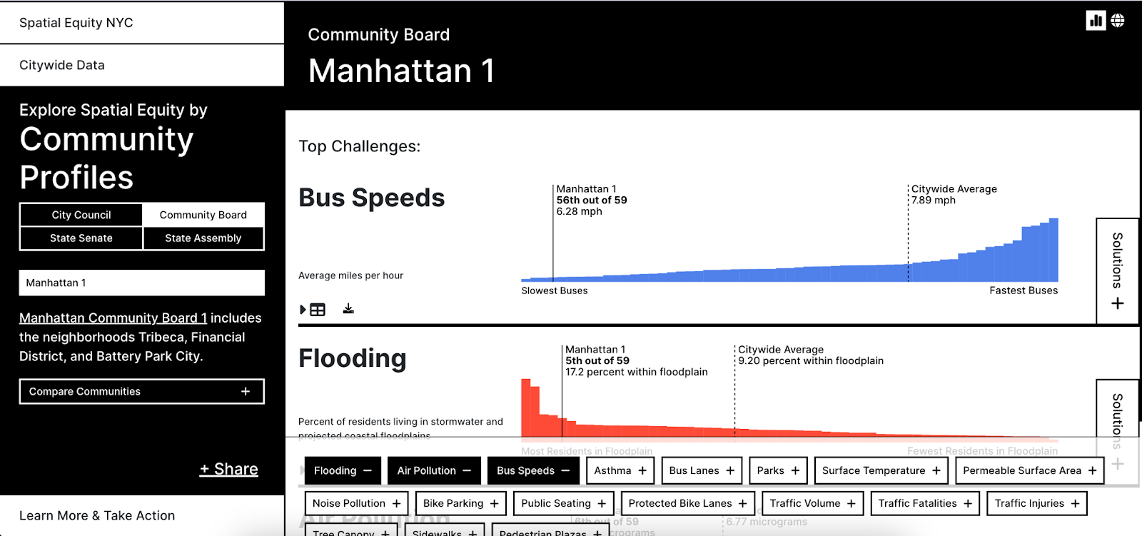
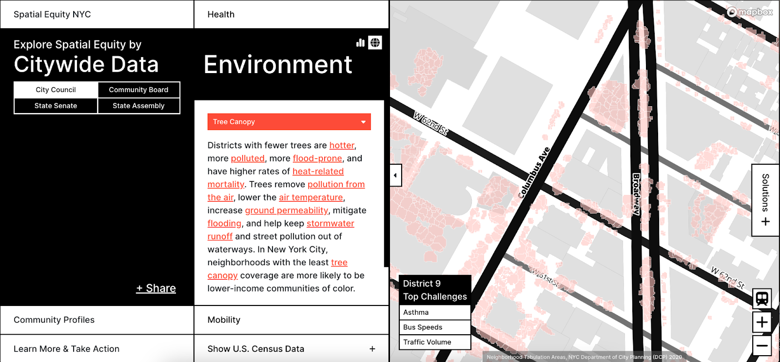
Aggregating data to relevant political geographic boundaries enables users to understand the performance of their community in relation to others. For each indicator, Spatial Equity NYC ranks communities based on measured data. These comparisons visually manifest across the different views of the website. In the map view, color gradients are used to measure intensity of the measured value. Similarly, in the histogram view, a greater slope between any two bars is representative of greater disparities in measurements across the different communities they represent. Finally the chart view orders and ranks the communities’ performance in a specific indicator by data value. In a “report card” view, the tool is also able to identify and present the top 3 indicators in which a community is performing the worst in comparison to all other communities as “Top Challenges.”
Side-by-side display of demographic information with health, environment, and mobility indicators
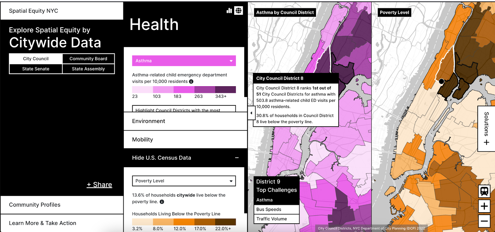
Users have the option to toggle on a side-by-side visual comparison of outcome indicators with demographic indicators in a “linked view”. The maps are linked in that manipulation of one map will apply to another such that zooming and panning to specific regions will always show the same area on both. By mapping social indicators such as race and ethnicity or income level against health, environment, and mobility indicators, the intersectional nature of equity planning is realized in that users are able to understand how certain outcomes or potential solutions interact with and can exacerbate existing inequities.
Linking problems to solutions
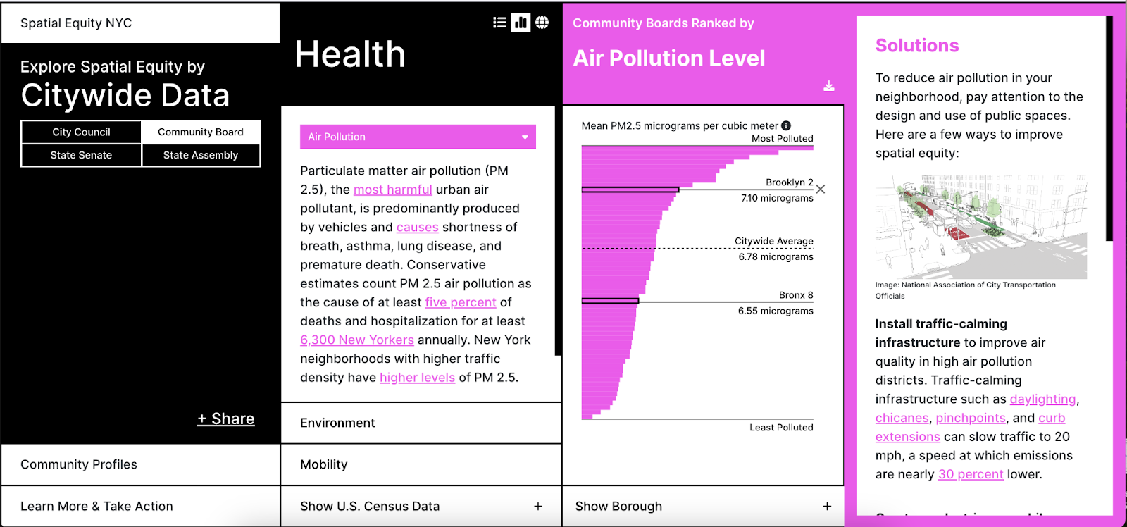
The tool presents a set of actionable solutions compiled and recommended by TA for each indicator, including links to external resources which the user can investigate further.
Providing street level information
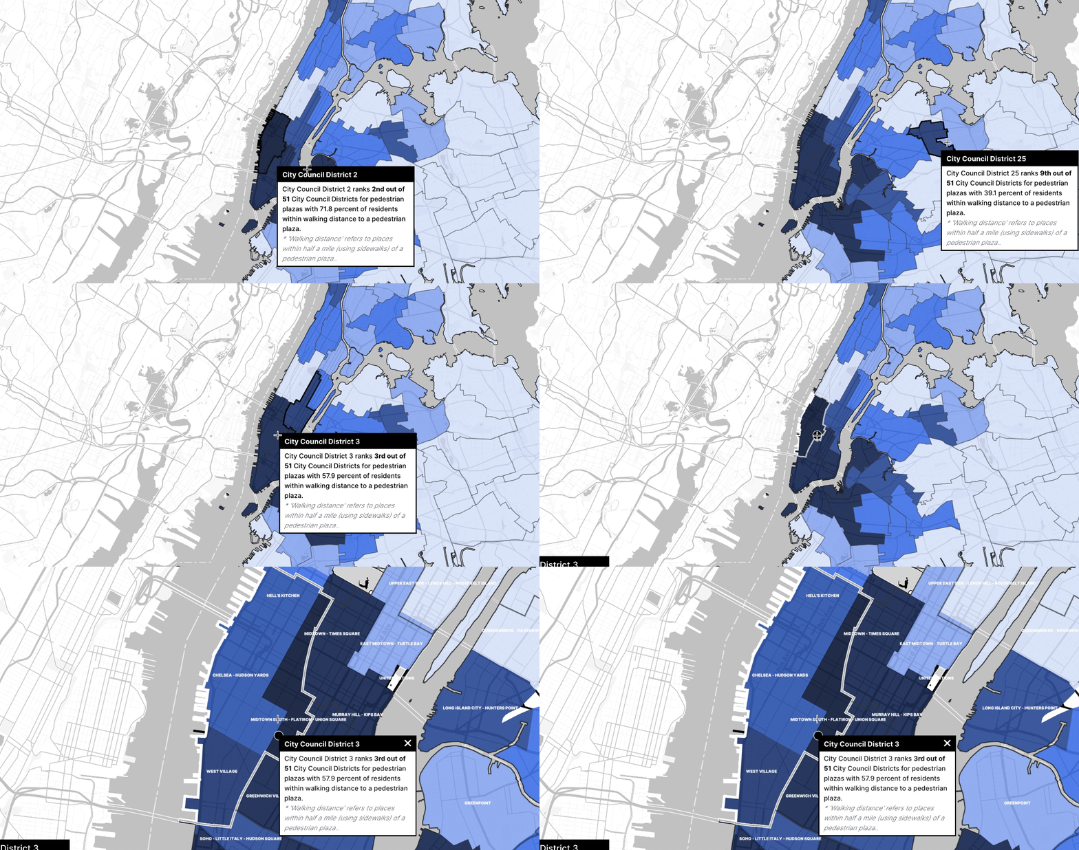
Visualizing street-level information, relates the user with the region of interest, further contextualizes them with the data and allows for street-level advocacy. Street level data is available for indicators such as traffic fatalities, flooding, tree canopy, and bus lanes.
Tech Stack
React, Redux, Mapbox, Deck.glMore
I also wrote my undergraduate thesis on the impact of the tool in policy-decision within local city government. In the process of writing my thesis I also helped present the tool at NYC's School of Data.Contributions
Initially, I worked on the software development of the tool. In collaboration with two other developers, I made significant contributions to the development of v1 of the web application. I programmed the component library, fluid transitions/animations, and state management for the project as well as aided in the development of map interactions and general debugging. I sought to make the application responsive across different screens as well. I attended weekly meetings between the LCAU and the non-profit Transportation Alternatives to deliver technical updates.However, following the release of the second version of the tool, I researched the impact of the tool by designing questionnaires and quantitatively analyzing responses and user interviews.
